
1. Kitchen Overview
If you plan aesthetic home design, then you want to design and decorate your home to make it look more attractive. There are several things that you should pay attention to and what you should not do in choosing a paint color. Of course, if you choose the wrong color, the interior appearance of your home kitchen will look unattractive and make you are boring.
Making new paint will instantly change the feel of the room in your home. So, be careful in choosing paint colors and don’t choose the wrong one. For that, you must know which house paint colors should be avoided so as not to interfere with the aesthetics. We hope this review can be a guide for you to beautify the interior of your home kitchen to make it look aesthetic and attractive. Therefore, let’s look at reviews of ideas and inspiration for the best paint for you.
2. Ideas and inspiration
Choosing the right paint color for the kitchen can be a difficult decision. Given the number of those colors and will be the design of the house for several years. For this reason, you need to find ideas and inspiration to get the best colors, and you can use it for many years.
Many paint colors can be used in the kitchen. However, some paint colors should be avoided in the kitchen so that your kitchen interior still looks beautiful, clean, and bright. For that, we provide some kitchen paint colors that you should not design in your kitchen. For that, let’s follow the review of some examples of paints that you should avoid for your favorite kitchen.
3. Some paint colors to avoid
Many people do not understand the function of paint color in the house. Therefore, we want to share ideas to provide some examples of paint colors that you should avoid in the kitchen and dining room. At first glance, we don’t care about this, but after you paint the kitchen interior, the result will look unattractive and make your appetite for cooking and eating disappear. For that, let’s look at the explanation as follows as below. Let’s follow our article. Hopefully useful for you and your family.
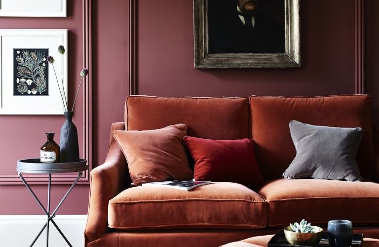
Red kitchen design
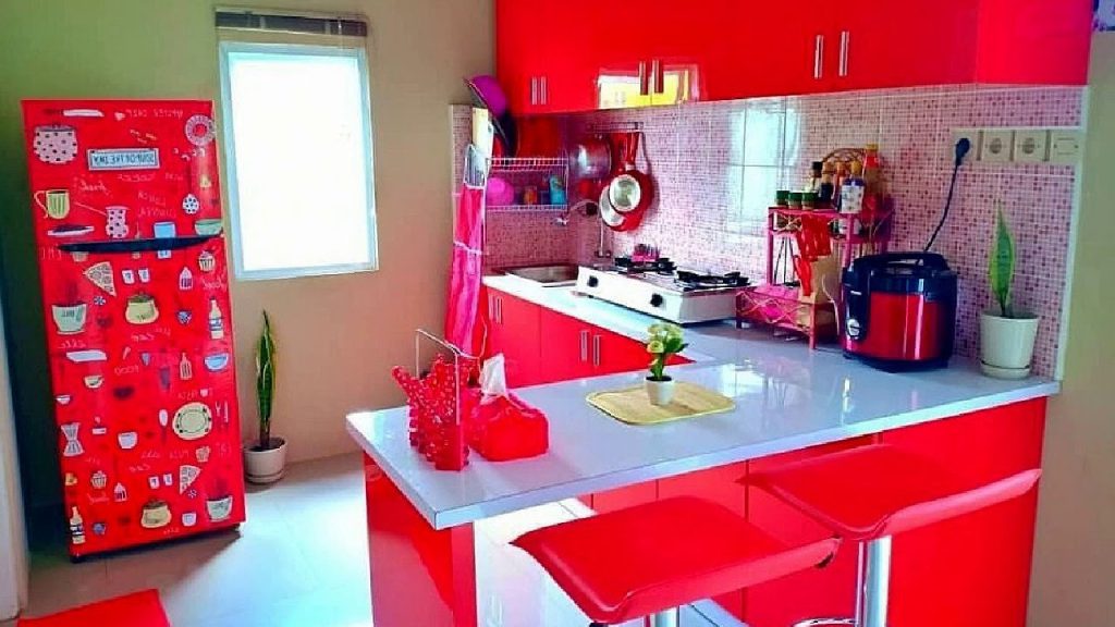
Red has always been a controversial color choice for use in the kitchen. Tobie Lewis, Manager of Valspar—one of the paint brands—warned not to use red paint in the kitchen. Therefore, the thing to watch out for is not painting large areas of the kitchen red.
We know the kitchen is a space to relax while cooking, eating, or entertaining friends. For many people, the red color looks uncomfortable. Despite its analytical abilities, red has the potential to make the appetite go away. Many people use this color both outside the kitchen. But If you want to design a kitchen, we hope you don’t use this color. Happy decorating!
Avoid white paint for the bathroom
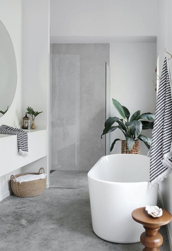
Many people say that white wall color is popular for bathrooms. This color can make everything look new and shiny. But the new look can not last long because it is quickly dirty. This color stains easily and is very visible on the bathroom wall. So, it’s not the right color choice for your bathroom. Therefore, you can choose a bolder paint for the bathroom walls
Then, to make your bathroom look more beautiful, you can paint the color of your bathroom walls with other colors such as pink, orange, and bold colors. By painting the bathroom walls in bright colors, your bathroom will look attractive, I hope this review can use for you. Good luck.
Brown paint for the outer walls of the house
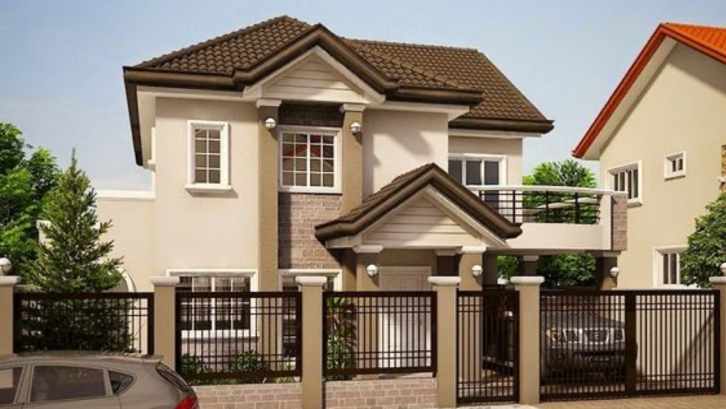
Sam Whittaker, pakar desain rumah dan editor di The Golden, mengatakan Bunda tidak boleh mengecat dinding luar rumah dengan warna cokelat, yang menurutnya adalah warna yang memberikan “getaran yang sangat membosankan”.
Tidak hanya itu Bunda, Whittaker juga mengatakan bahwa di masa depan, warna ini akan menurunkan nilai rumah Bunda dan mempersulit penjualan properti.
Dark gray for the kitchen
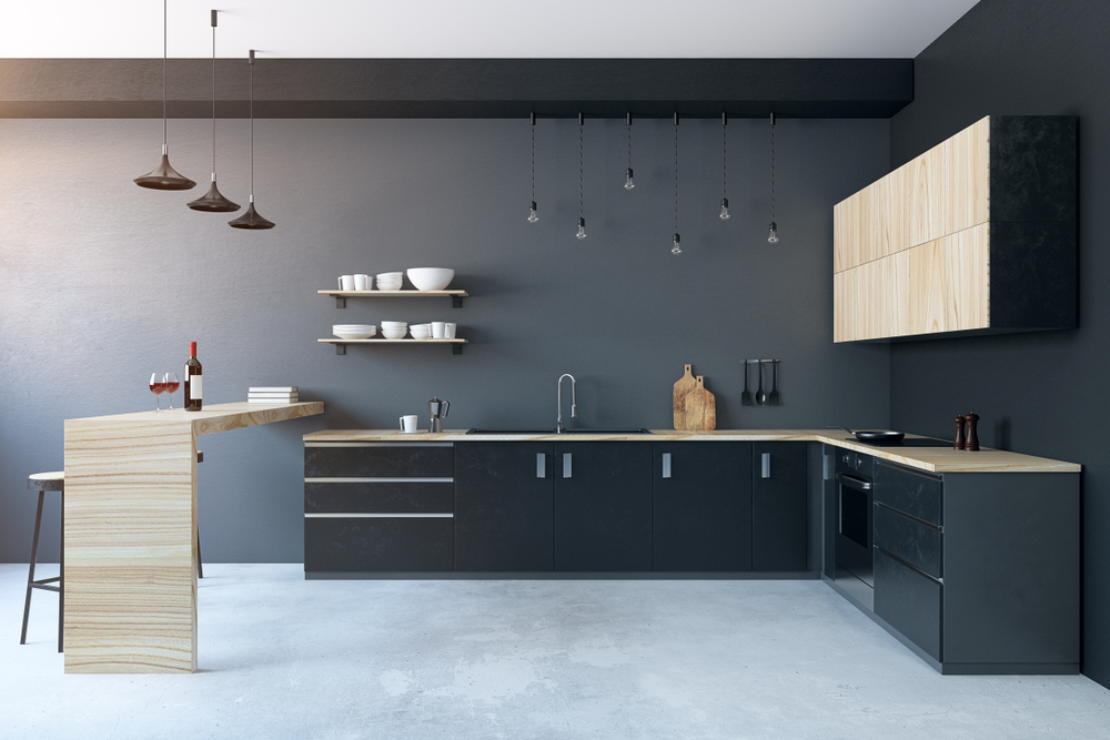
The gray color design does look elegant for the house. But you have to keep dark colors away from the house exterior. Gintaras Steponkus, a marketing manager at Solid Guides, says this color is known to stimulate depression, loss, or hostility. Even quickly provoke emotions that see it.
It makes it very loud and difficult to design a small kitchen without windows. Therefore, you should make it in the garden or side of the house so that it is not easily dull when exposed to rain and sun. As far as we know, this color is many designed on the upper side walls of the house. But if you want to make the gray color in the house, you should consider the right location for this color. Happy decorating!
Bright white kitchen
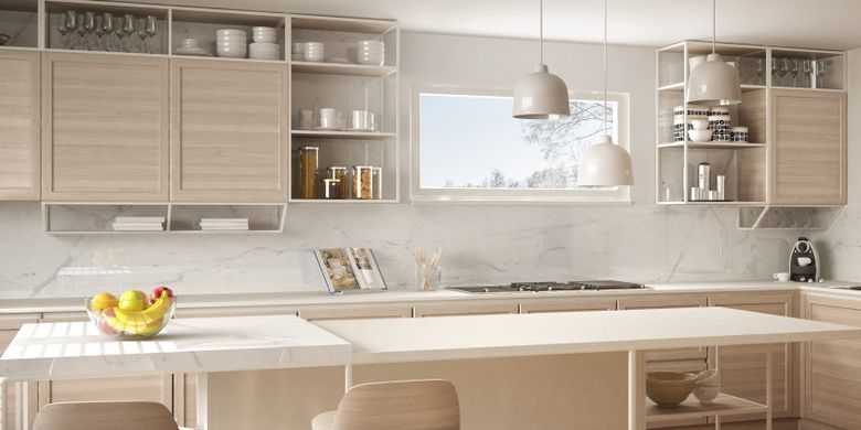
If you want to look your interior kitchen attractive, you need to avoid bright white in kitchen designs because bright white is easy to get dirty from splashes of oil or food. Therefore this color is one of the kitchen trends that should be avoided. In moderation, bright white is not lovely by designers. “Classic white kitchens, but bright whites tend to feel striking. However, if you still want to incorporate white kitchen ideas into your home, we recommend choosing creamy white for a much warmer and inviting feel.
To balance your kitchen. To make it look cool, please add a neutral wood color kitchen set, beige hanging decorative lights, and a wooden kitchen table. With a design like this, your kitchen interior combination will feel more comfortable and pleasing to the eye. Well, please try this color.
Bright yellow color
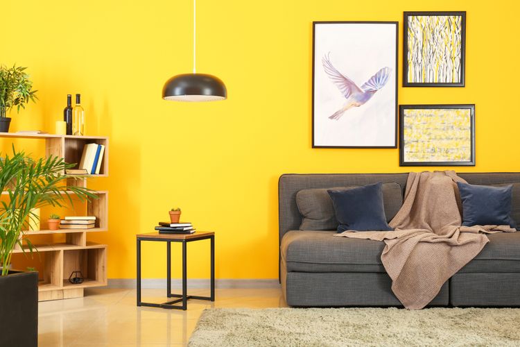
If you like yellow, it looks like you have to be able to resist the urge to paint the space in the house. But if you stop your desire to paint this color in the house interior, you will feel comfortable in the room.
Hold your appetite that makes you tired. You should apply the yellow color to the house exterior so that it is easy for your eyes to see and easy to recognize by your guests. Therefore, you should not install yellow in the living room that can make your view uncomfortable. In addition, the color yellow also quickly stimulates your emotions.
Dark brown color
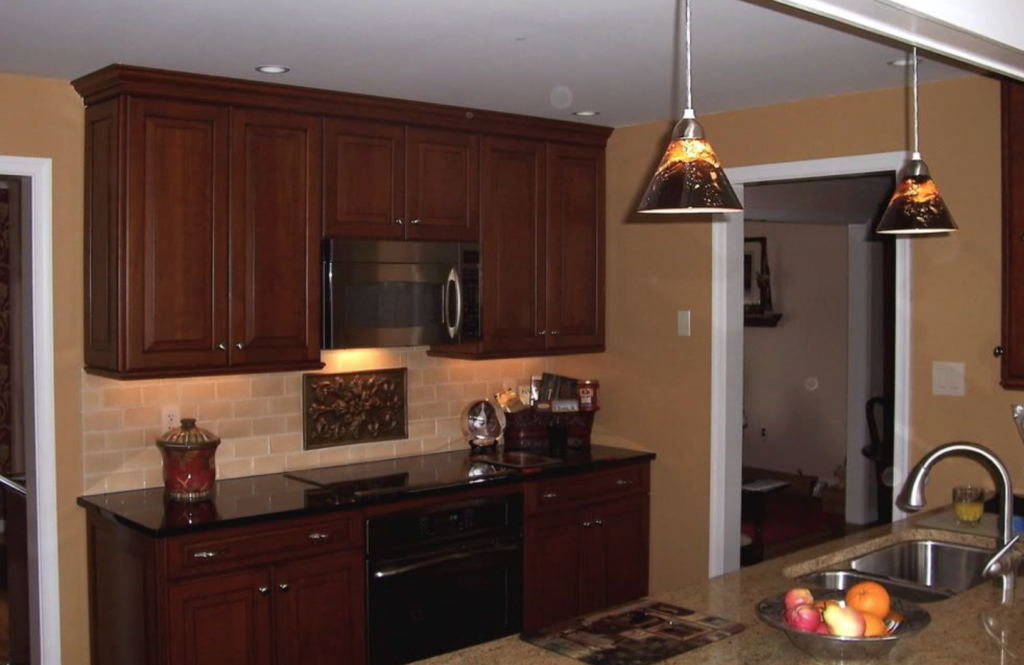
If you want to paint a room brown, the difference between a calming effect and a depressing effect lies in choosing the right color. “Darker colors can produce a cave-like effect. So the room interior feels gloomy and lowers energy levels. Therefore, we recommend using dark brown as an accent color and choosing lighter browns on the walls.
But if you like dark brown, you can apply it to the exterior of your house to make it look beautiful. Then, combine this color with a bright color, so it looks harmonious. Don’t make this color in the kitchen or living room because it will look dark and dull. Hopefully, this review can use for you.
Pastel pink color
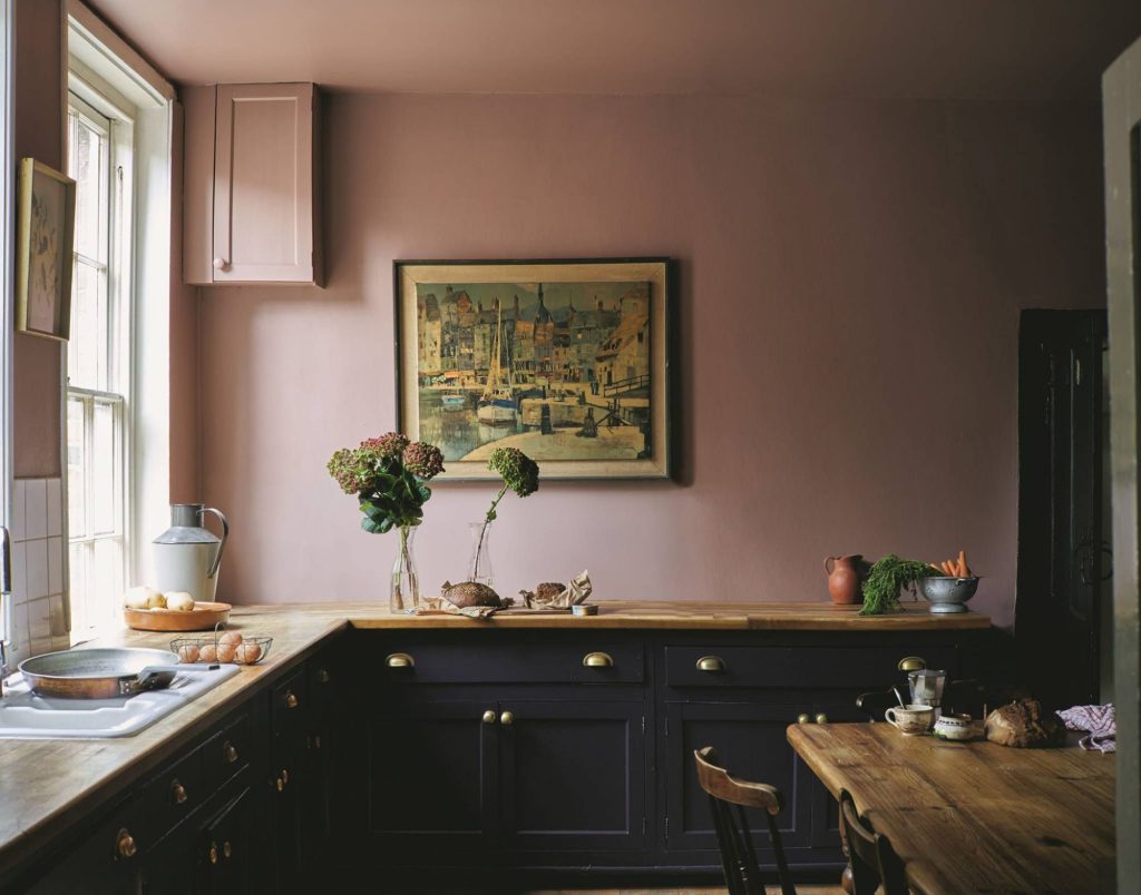
Finding soft pinks or pastel pinks can be challenging as some colors lean more towards very light pinks. “The wrong pastel can reduce space and create an overly saturated look. Therefore, this color is widely designed in women’s bedrooms to make the atmosphere more elegant and fun.
But if you want to design this color in the living room, you have to be good at arranging color combinations to make it look harmonious. Then, you have to the arrangement of furniture must also be adjusted so that it is pleasing to the eye. In addition, you can also design this color in the kitchen with a brown color combination. With this combination, your home interior will look more charming. We hope this design can be an inspiration for you.
Reddish brown color
Having a lot of reddish-brown tones can increase anxiety or anger. Plus, this color is a warm hue with a hint of black, and it can make the room interior feel smaller and cramped. Therefore, if you want to apply this color, you should use it on the exterior of your home to make it look more classy.
In addition, this color is also very suitable for you to apply bright exposed bricks. With this color combination, the exterior of your home will amaze people. In addition, this color is also suitable for home garden colors to look more natural. But you should not install this color in the kitchen and living room because it can make your home interior design uncomfortable and cramped.
Use of orange
In addition to beautifying the appearance, the color of the paint on the walls of the room also serves to strengthen the character of the room. Therefore, the paint color also has its character. We cannot carelessly apply colors to a room, such as colors that are not suitable for the bedroom, including red, yellow, or orange which gives an injection of enthusiasm.
In addition to the colors mentioned above, another bright color that should be avoided when painting your house is orange. The orange color has a strong and dominating impression. So it cannot be modified and combined with other colors. For that, the bedroom should provide a comfortable and relaxed feel. The choices include shades of colors such as blue and light green.
Conclusion
Paint colors not only make a room look beautiful and tidier. But they can also have a significant effect on mood swings. As we discussed in this article, designs of some colors like mud gray can lower a person’s mood, then red and yellow can provoke our emotions and make a room uncomfortable to see.
Therefore, if you want to design the interior home to look beautiful, aesthetic, attractive, and fun, you must adjust your paint color to the room interior to make it pleasing to the eye and make you and your family comfortable. Hopefully, this review can use for you. Happy decorating!


